deviant art


Login
Join deviantART for FREE Take the Tour Lost Password?
Deviant Login
Shop
 Join deviantART for FREE Take the Tour
[x]

More from *JoeJesus

Featured in Groups:

Details

April 29, 2009
548 KB
1250×781
Link
Thumb

Statistics

Comments: 85
Favourites: 1,045 [who?]
Views: 17,002 (8 today)
[x]
:iconjoejesus:
...longer exposure to your eyes is highly recommended...

:icondonotplz::iconusemyartplz:

...for inspirational purposes only...
:icon:
Add a Comment:
 
:iconj4m3sb0nd:
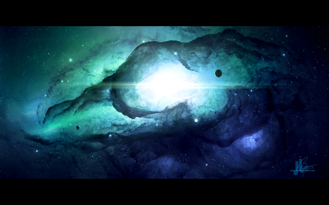
This is an interesting one. My very first impression of it was that something was lacklustre about it, as if it were a little flat. But then I gazed at a bit longer and, as if coming to the right exposure, a much greater depth showed itself and made the piece a lot more enjoyable. This is somewhat double-sided - on the one hand, it develops a great sense of depth with contemplation, and on the other hand, there is a lack of highlights in the darkness which eludes one's immediate grasping of depth. Still, it is this very ambivalence which makes it so interesting, a great intention there, since it does make it a piece which makes a more lasting impression than many others, albeit not straight away.

Concerning immediate impression, the lack of light interaction with the edges of the nebulous haze to show reflectivity, and the sense of clone-brushing here and there (i.e. left of the stellar nursery) does bring it down. It may understandably be difficult to add such alterations to depth without taking away the contemplative sense of the piece, but the cloud repetition could at least be modified. But even though there is critique concerning that, there is still much else which is quite nice about this piece.

The starfield, for one, and the subtle gradients of light and hue about the piece all add to the overall splendour of this piece, especially in its contemplation. The planets, although they seem to be setup very simplistically, do have an enjoyable sense of counterbalance between each other in the composition. In this way, the minimalism of the piece is essential the aforementioned contemplative quality of it. Such a quality is what one could worry about losing with further alterations, due to the fragile nature of minimalism when adding and changing things. Still, it could be possible to add just here and there a few well-placed streams of light reflecting off the nebulae, and conjunction with the slight variation of texture in parts.

Although there are minor details which could be improved, not to change the piece so much as to draw more people into the actual contemplation of it, the piece is as it stands another good piece of artwork from you. It is this difficult balance of a flat initial impression with a thoroughly contemplative impression of depth which makes this particularly difficult to rate, and yet which makes it work. Thus my suggestions that, if it were to be modified, to do so only to compliment the furtherance of others contemplating it - thus, minimal changes for a minimal piece. With this in mind, excellent work, and it would be a pleasure to see some more works with such a contemplative aesthetic - so, I say well done!
What do you think?
The Artist thought this was FAIR
40 out of 45 deviants thought this was fair.

The Artist has requested Critique on this Artwork

Please sign up or login to post a critique.

love 0 0 joy 1 1 wow 11 11 mad 0 0 sad 0 0 fear 0 0 neutral 0 0
:iconnoobanoob:
waaah laav the dragonnn!

--
Spam spam, its bad for your mail. the more you post the more you fail
[link]
I believe in Jesus Christ as my Savior. nuff said
comission/request info [link]
Reply
:iconjoejesus:
*JoeJesus May 12, 2012   Digital Artist
it's a raven...

--
...you want something done? - ask a busy person...
...you want something done RIGHT? - do it yourself...

:) Tutorial to all my works: [link]
THIEFS: I don't bother with lawyers, I send hitmen...
Reply
:iconnoobanoob:
its a dragon-raven....:iconheplz:

--
Spam spam, its bad for your mail. the more you post the more you fail
[link]
I believe in Jesus Christ as my Savior. nuff said
comission/request info [link]
Reply
:iconribbaribbahey:
Can't I get a bigger one for my desktop? D:
This is my favuorite space artwork of all by far.
Reply
:icontetriarch:
Mood: Amazed ~tetriarch Apr 17, 2012  New member
Co ti na to říci. Líbí se mi barvy, rysy mlhoviny a vůbec celkově styl celé tvé práce. A tím teď myslím i jakýkoliv jiný obrázek ve tvé galerii. Dost mě zaujalo také to, že kompozice té mlhoviny je tvořena do tvaru dračí hlavy. Nevím jestli úmysl či záměr, ale rozhodně se to povedlo. A tím teď myslím i jakýkoliv jiný obrázek ve tvé galerii.

To co umíš ty, chtěl bych umět taky.. aspoň z 5%, ale přenechám talentům ;) Jak jsi řekl na tohle je třeba cit, který nemám ;)

--
Don't waste your own shadow.
Reply
:iconjoejesus:
*JoeJesus Apr 21, 2012   Digital Artist
Děkuji. Vlastně to má připomínat hlavu havrana, proto taky ten název. :)

--
...you want something done? - ask a busy person...
...you want something done RIGHT? - do it yourself...

:) Tutorial to all my works: [link]
THIEFS: I don't bother with lawyers, I send hitmen...
Reply
:icontetriarch:
~tetriarch Apr 21, 2012  New member
jj chápu, a už to v tom i vidim. rozhodně je to luxusní dílko.. já vim že nikdy nikomu neposkytuješ tutorialy na to jak dělat tak luxusní dílka, ale když si projdu tvoje tutorialy na tutoriarts.cz jsem tak trochu na dně v tom, jak pokračovat, jak uděla svá díla lepší, jak zlepšit mlohoviny ;) a tak, páč jsem jen při myši a na tablet nějak ani nechci šetřit, konec konců tohle je pro mě spíš koníček než něco s prací, jsem konec konců student obchodní akademie ;) všechna má díla jsou na jedno brdo, což si zde snadno potvrdíš a já vůbec netušim jak z toho ven SA už jsem aspon pul roku nedelal, ztratil jsem vizi no :(

--
Don't waste your own shadow.
Reply
:iconbearriots:
I just noticed the raven.
Reply
:iconrich35211:
*rich35211 Mar 3, 2011  Professional Filmographer
GREAT DEPTH AND COLORS IN THIS ONE!!!

--
Visit My Gallery Here
[link]
Video Show Reel 2011 [link]
Reply
:icon:
Add a Comment: